

Over the course of a semester, we conducted research and began the early steps of redesigning HOKIESPA. We conducted a survey across the Virginia Tech campus and had 150 respondents. Our goal was to uncover the flaws within the current design and begin to fix the issue using our skills as designers.
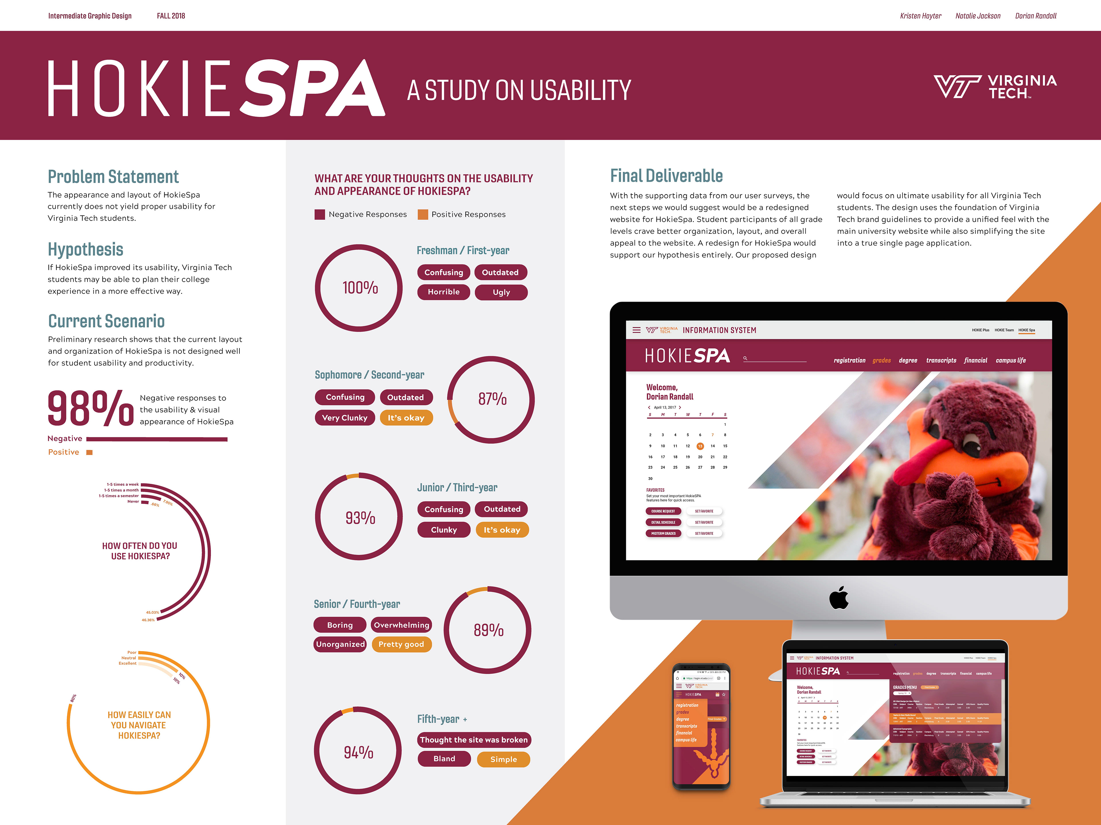
Our research implied that the overall usability of HOKIESPA was severely lacking according to modern standards. For example, the site is not accessible nor is it responsive to mobile, which is the primary way people view the internet in modern times. 98% of our respondents reacted negatively to HOKIESPA upon using it for the first time.
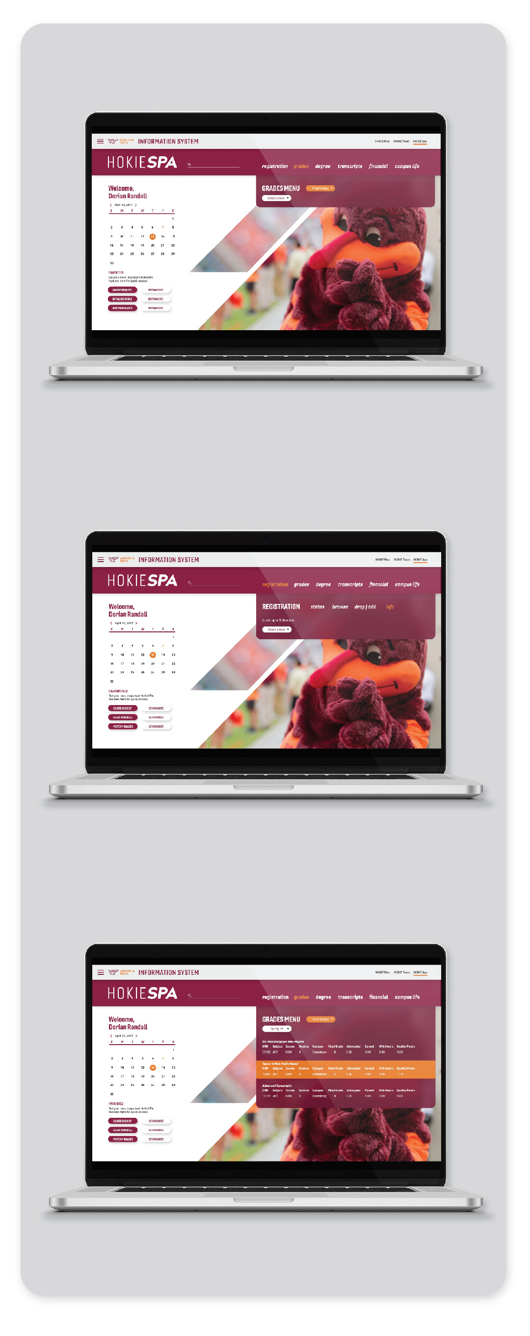
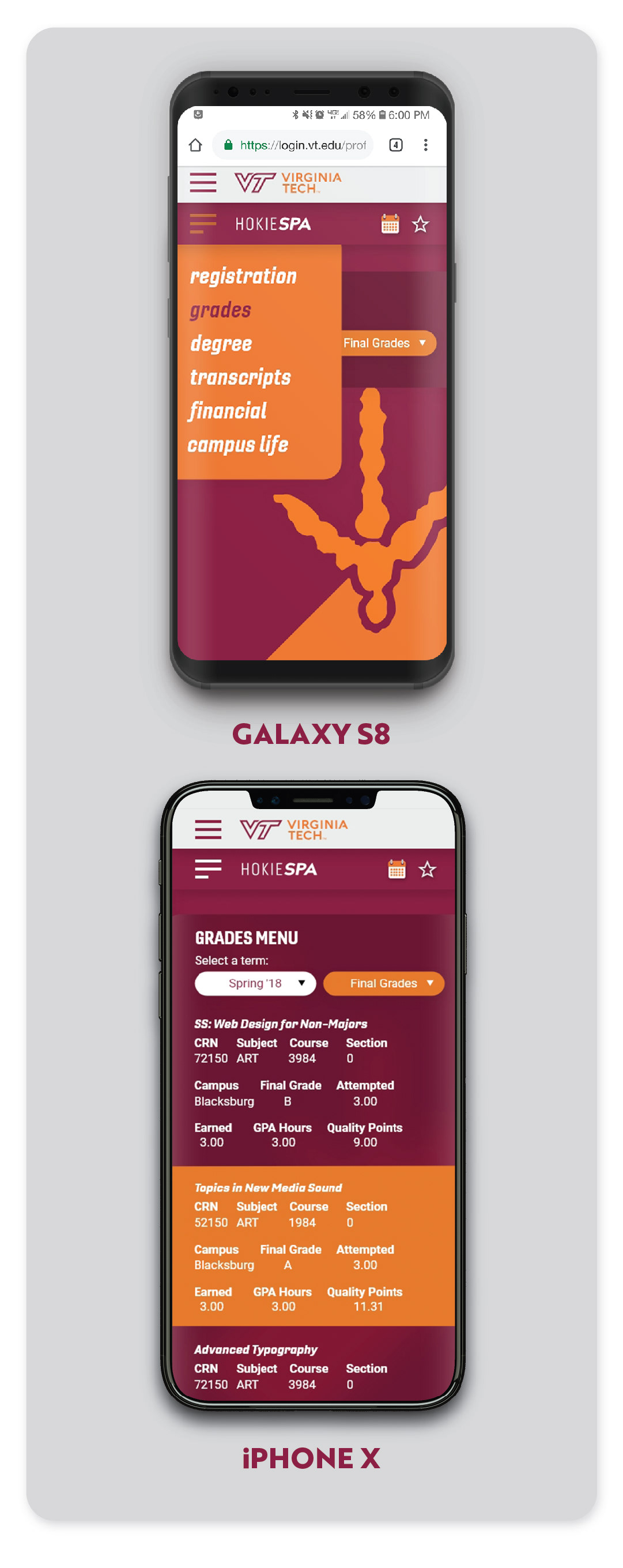
I was in charge of creating a potential design to apply what we learned from our user research. The results are below.
This design a more streamlined and pleasing experience for students, while adhering to Virginia Tech brand guidelines. The acronym SPA mean single page application. Therefore this design attempts to fit all the functionality of HOKIESPA, in a one page website.
One of the main issues we learned from our survey was that it was too hard to find things. For example, the grade menu requires you to navigate 3 different pages, each with long lists of text, to view your grades. In our redesign, it has been streamlined to only 3 clicks. Here is an example below.
Below is an interactive prototype, made with Adobe XD
Above is a limited prototype of the redesign. The grade menu is an example function that shows how the website would work.
THANKS FOR
VIEWING!