
logofolio
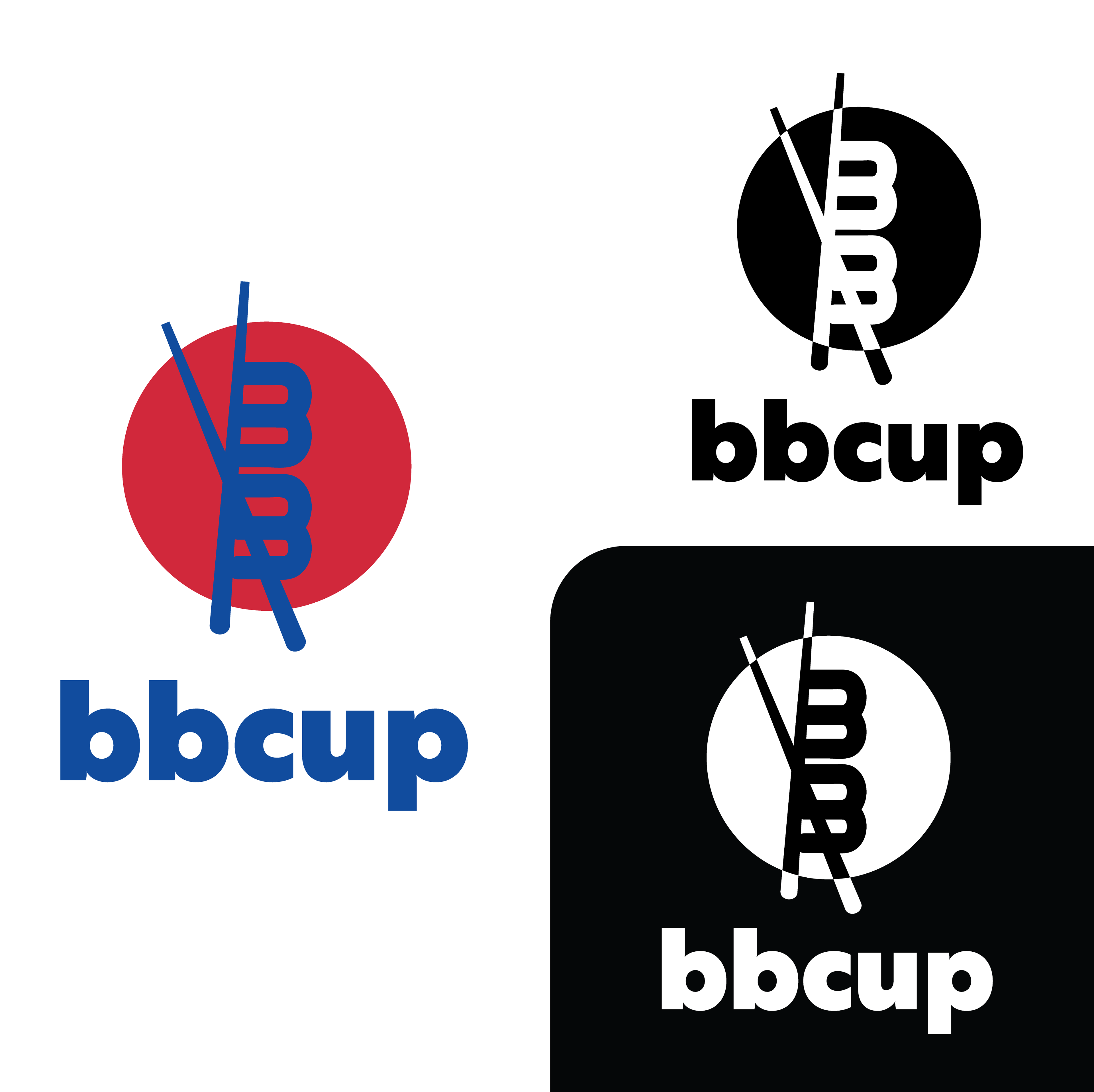
BB Cup is a local Blacksburg restaurant specializing in Korean cuisine. BB stands for “Bi Bim”, which means ‘mix in’. The food is served in cups. It’s fast and the location is welcoming and modern. My logo mimics the shape of the bowl, the common serving platform, from above. The chopsticks, being the primary way to eat at BB Cup, rest on the top of the bowl, while also informing the viewer about the type of cuisine they might expect at BB Cup. The red and the blue signify the colors of the Korean flag.
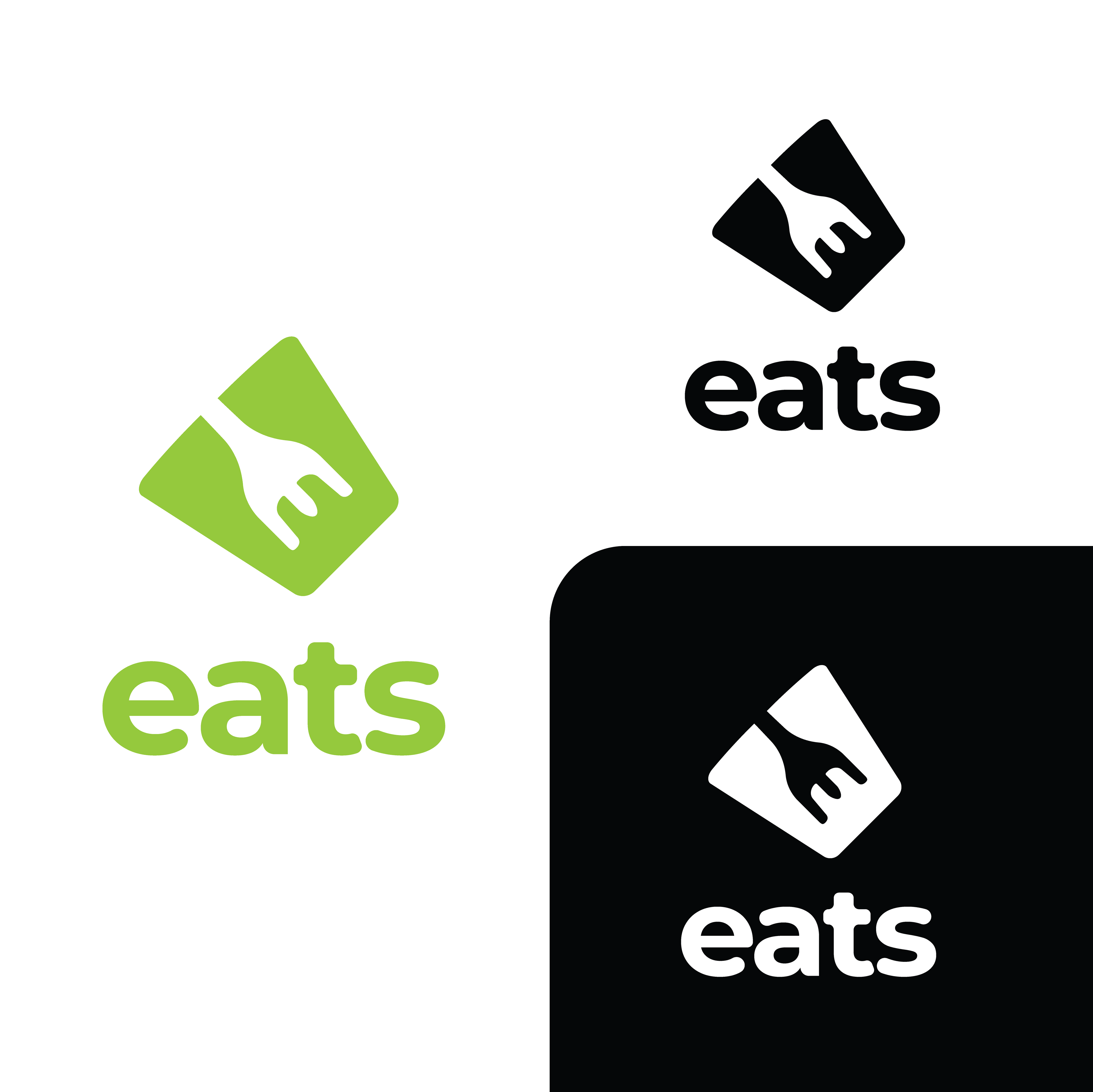
Eats is a local Blacksburg grocery store. Since 1974, Eats has prided itself in its natural and gourmet foods, sourced locally and also from around the world. I wanted the logo to have a natural and inviting feel. The light green is meant to represent the all-natural vibe of the grocery store. The fork, a well-recognized symbol for eating, also mimics E. This is also very versatile, and can be displayed in a range of different colors, to accommodate the variety of the stores stock.
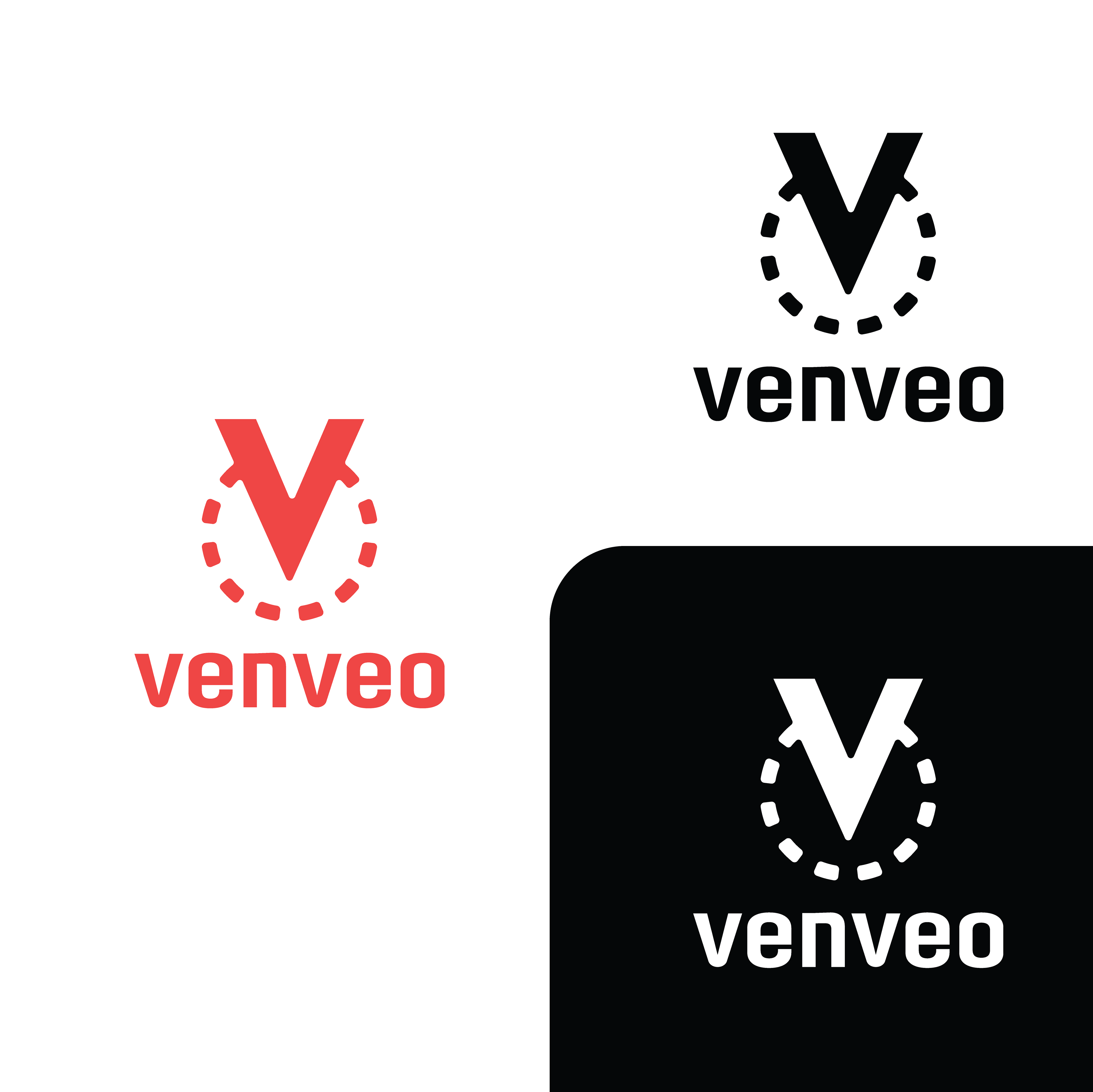
Venveo is a building material marketing firm that is based out of Blacksburg. Their goal is to help material manufactures market their products to architects, contractors, designers, etc. A simple V surrounded by a dotted line is what I eventually decided on. The V is, of course, representative of the company name. The dotted line is reminiscent of dashed lines that may be found in blueprints used in construction. It is meant to feel mechanical, but also modern. I used the official red of Venveo.